Magne B6 has announced a complete refresh of the brand’s visual language with the support of independent brand elevation agency, Free The Birds.
Sanofi Consumer Healthcare’s Magne B6 brand sought a design solution which repositioned the product as a mental health wellness brand in key markets across Europe.
The refreshed identity supports strengthening of recognition and reputation with healthcare professionals and consumers who have used Magne B6 reactively for over 30 years.
As the body cannot produce magnesium itself, it must be absorbed through diet. If individuals don't get enough magnesium in their diet, then symptoms may appear. However, otherwise healthy individuals often don't show symptoms of low magnesium intake.
70% of category and Magne users look for solutions only when related symptoms appear. Until today, Magne B6 has been viewed primarily as a reactive solution.
Due to this imbalance, Free The Birds was tasked with the transformation not only of the brand’s Magne B6 packaging, but also the perception of the product and its daily usage, both on and off pack. A key objective was to drive brand penetration across a multitude of consumer touchpoints, creating a distinct look and feel which enforced the benefit-led architecture of Magne B6 as a wellness brand.
The development also comes at a pivotal time for the wellness market, as mental health products including digital apps are ever-expanding in the market.
Through Free The Birds’ expertise in creating brand visual identities, the refreshed branding for Magne B6 aims to encourage recognition of its benefits as a wellness brand.
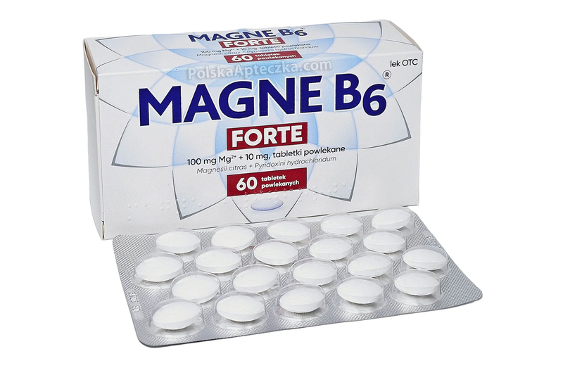
Free The Birds created a brand marque as a core focus which speaks to the key objective of supporting strength of mind. The marque visualises crystal shards, signifying strength of mind for consumers. The crystal shard becomes an omnipresent factor in product displays, marketing and communications including TV advertisements and the website.
The new brand identity allows for products in multiple markets across Europe to share the same impactful artwork despite slight differences in product name.
Nick Vaus, Co-founder and Managing Partner at Free The Birds shares: “The nature of designing packaging for health and wellness products always presents an exciting challenge, as potential customers must feel an immediate sense of recognition and trust in the products they choose to purchase. This is never more prevalent than with products which are to be considered as a wellness brand, over and above products which serve a specific purpose for those suffering from a deficiency.”


