
What would our world be without colour? For humans, it’s a way to understand what we see, to stand out from the crowd and to communicate with others.
Now, more than ever, consumers worldwide are seeking opportunities to connect with one another and using colour to tell stories about themselves in both the real and digital world through their clothing, purchases and richly hued social media feeds. Research has even suggested that the number of “Likes” a photo receives on Facebook can be swayed by its colour and brightness level.1
This is just one study within a broad body of robust research that demonstrates how colour can influence consumer interaction and engagement, both online and off. Indeed, as many as 92.6% of shoppers claim that visual elements have the biggest influence on their decision to buy.2 For brands and producers in every industry, colour psychology and return on investment (ROI) are intrinsically connected.
Telling colourful tales
Colour has different meanings within diverse cultures around the world, but there are some common colour stories to be found everywhere; today, they are amplified thanks to the Internet’s power to turn local stories into global ones. Most colours have, by now, accumulated a set of emotional, practical or physiological characteristics and associations, which can be as widespread as red indicating passion or green suggesting nature.
A growing body of research has substantiated and expanded on the traditional meaning and significance of colours.
Crowley, for example, found a correlation between longer wavelength, warmer colours and increased levels of arousal or activation, whereas shorter wavelength, cooler colours such as blue seem to have a more calming effect.3
Later, Elliot’s 2015 paper provided an overview of colour theory developments since Goethe’s work in the early 1800s, drawing on Elliot and Maier’s colour-in-context theory. This posits that social learning and biological disposition both have a role to play in how humans respond to colour.4
Subsequently, colour psychology has often been applied to great effect in advertising spaces. Brands and consumer products, for instance, are usually packaged using a specific colour story that tends to be associated with the product’s application, such as blue to indicate health and hydration, pink for femininity, purple for creativity and relaxation, yellow for energy and red for passion or prestige.
Healthy hues
It naturally follows that colour plays a vital role in the design and creation of food supplements and has a long history of use in the industry. A colour’s classic associations draw consumers to connect it intuitively with certain health and wellness applications, which brand owners have reinforced with time: take lavender to aid sleep, for example, or blue for hygiene.
A report by Bosch, et al., on colour in healthcare settings further highlights the use of orange to stimulate appetite, red to increase energy and yellow to aid digestion.5
In fact, the longstanding use of colour in consumer health settings predates much of our understanding of the actual colourants — a recognition that is still growing day-by-day as food additives once considered to be safe for human consumption are brought under closer scrutiny.
A 2007 study by researchers at The University of Southampton, for example, identified a group of six commonly used artificial colourants that appeared to be linked to an increase in ADHD-type behaviour in children.6 Although this research has since been disputed, public backlash was significant enough to convince a large number of food manufacturers to put a voluntary ban on each of these so-called “Southampton Six.”
Eye-catching, emotive appeal
Despite these concerns, colour itself remains a highly desirable attribute for food supplements and offers multiple benefits for both brand owners and consumers. Colour creates visually appealing and distinctive dosage forms that increase brand recognition and differentiation, enabling supplement products to stand out in a competitive marketplace.7,8
Colour also has the power to deliver on aspirations by association: increasingly, consumers are flocking to brands whose colour stories reflect their own ideals. It is one reason why, every year, a new influx of goods arrives in Pantone’s Colour of the Year. A colour can bestow “coolness,” leveraging current trends to increase visual appeal and desirability.
It is clear that, in both consumer-facing and industry settings, colour enhances the power of brand storytelling. It can be used to tell positive stories about a food supplement brand and its products — how they are made, how they work and what benefits they offer, both in terms of specific, concrete details and in a broader, more aspirational sense.
Recent consumer research in Germany also indicates that 83% of food supplement users consider the colour of the dosage form as an important decision-making factor.9
Seeking a safer spectrum
It follows, then, that colour brings high value to today’s aspirational consumers — a large and growing group that’s defined by the importance they place on health and well-being, their love of shopping and their preference for responsible consumption. Studies done in Germany, Italy and France also showed that today’s value-driven consumers seek high quality, safe and science-backed food supplements with a robust clean label positioning.9
Their preferences are a key driving force behind the growth of the clean label trend, which insists on requiring food supplement makers to prioritise a planet-first, sustainable and transparent approach from development right through to the final product. This has seen clean label continue its rapid rise within the food supplements space as consumers become increasingly responsible buyers.
Meanwhile, in markets such as the UK, those using supplements most frequently are more likely to buy a supplement if it contains sustainable or ecofriendly ingredients (although a positive response is indicated across a broad range of demographics).9 To achieve the truly holistic credentials these consumers expect, brand owners must look for solutions that meet the demand for colour without compromising on a clean label positioning.
Brighter by nature
In the wider food industry, these consumer preferences have already driven the emergence and growing popularity of “colouring foods,” an EU-designated category of edible plants that can be used to derive natural colours. These pigments are gently extracted using a non-selective water-based method.
This means that the colour is derived entirely from the edible food source and preserves the same nutritive and aromatic profile.
Now, colouring foods have even more to offer! Lonza has innovated to find new applications in its next-generation capsule technologies. The natural, variegated hues that colouring foods create in a finished supplement product act as a visual marker of the clean label thinking behind the product and enhances its clean label story, all while offering ingredient masking capabilities for improved aesthetic appeal.
Indeed, the use of colouring foods has been shown to create an emotive connection between the natural colour source and the finished supplement product, even if the colouring food isn’t present in sufficient quantities to deliver health benefits in the supplement itself.10
Clean label gets colourful
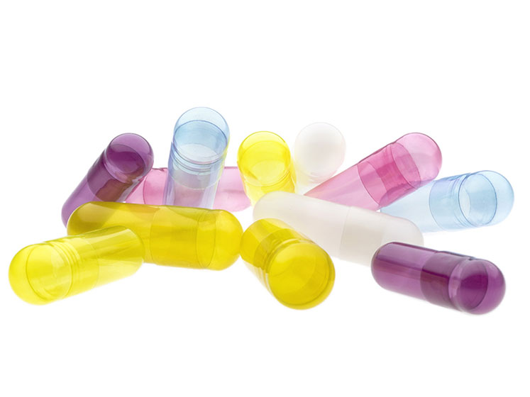
With such clear and growing demand for clean label colour, Lonza has expanded its range of Capsugel Vcaps Plus capsules — part of its new Responsibly Made Product portfolio — to offer a convenient, quality solution.
These vegetarian capsules, now available in Blue Spirulina, Purple Carrot, Red Radish and Spicy Yellow options, are composed of just two ingredients: hypromellose (HPMC) and a colouring food made from edible fruit or vegetables that does not require an E number and supports a plant-based positioning.
Thanks to Lonza’s market-leading capabilities and continuous innovation, Vcaps Plus food coloured capsules meet customer needs on several levels.
Not only do they provide the visual appeal that consumers are looking for, they also offer the high performance and excellent machinability that can help brands to achieve all-important product differentiation, as well as the versatility to support a range of capsule fills, including powder and Licaps liquid-filled capsule formulations. These capsules also come in lighter or darker tints, allowing for potential ingredient masking capabilities.
Now, capsules can offer the same colourful experience as the latest trending shade on Instagram.
Vcaps Plus capsules enable brand owners to bring their brightest clean label visions to life. Many of Lonza’s partner brands are already crafting on-trend supplement products that leverage the meaning and significance of colour to tell stories regarding function and health benefits. Inspiring examples include a Vcaps Plus Purple Carrot capsule paired with a lavender-based ingredient fill for a healthy sleep/relaxation formulation.
A Vcaps Plus Spicy Yellow capsule, meanwhile, could be used to enhance the visual appeal of a curcumin-based solution. Derived from algae, the Vcaps Plus Blue Spirulina capsule is a delivery format that could expand the story of a marine specialty ingredient, whereas a Vcaps Plus Red Radish capsule could leverage the colour red’s association with nutricosmetics for an eye-catching, plant-based nutraceutical solution.
Food colour for our future
In an industry in which colour is approached with caution at best, Lonza’s Capsugel Vcaps Plus capsules are rewriting the food supplement narrative. They provide a premium choice for brand owners, ensuring that the historic advantages of colour in marketing can finally be applied in the supplement space — in a responsible way that truly resonates with consumers.
Because, for responsible consumers, clean label isn’t just a label, it’s a promise, which means that brands must deliver on every level — from the ingredient right through to the delivery system.
Alongside choice comes quality support: Lonza’s integrated capabilities ensure its brand partners are equipped with the products, resources and guidance to bring their brightest clean label ideas from source to shelf, faster. As such, the food supplement consumer experience is getting cleaner, clearer and more colourful every day.
References
- S. Banerjee and A. Pal, “Likely to be Liked? A Study of Facebook Images,” https://ieeexplore.ieee.org/abstract/document/8392808?reload=true (2018).
- J. Morton, “Why Color Matters,” https://colorcom.com/research/why-color-matters.
- A.E. Crowley, “The Two-Dimensional Impact of Color on Shopping,” https://link.springer.com/article/10.1007/BF00994188 (1993).
- A.J. Elliot, “Color and Psychological Functioning: A Review of Theoretical and Empirical Work,” Frontiers in Psychology (2015): www.ncbi.nlm.nih.gov/pmc/articles/PMC4383146.
- J. Bosch, et al., “The Application of Color in Healthcare Settings,” www.ads.org.uk/wp-content/uploads/The-Application-of-Colour-in-Healthcare-Settings.pdf (2012).
- University of Southampton, “Food Additives and Behaviour in Children,” www.southampton.ac.uk/psychology/research/impact/food_additives.page (2007).
- K.V. Allam and G.P. Kumar, “Colorants: The Cosmetics for the Pharmaceutical Dosage Forms,” www.researchgate.net/publication/288468020_Colorants_-_the_cosmetics_for_the_pharmaceutical_dosage_forms (2011).
- L. Labrecque and G. Milner, “Exciting Red and Competent Blue: The Importance of Color in Marketing,” www.researchgate.net/publication/251277565_Exciting_red_and_competent_blue_The_importance_of_color_in_marketing (2011).
- www.nmisolutions.com/syndicated-data/nmis-proprietary-databases/supplementsotcrx-database.
- C. Spence, “On the Psychological Impact of Food Color,” 2015 https://flavourjournal.biomedcentral.com/articles/10.1186/s13411-015-0031-3.


